Below is an advertisement that was placed inside the "Thunderball" movie tie-in cover for Players Cigarettes in 1965. It is a light blue double sided "letter" supposedly written by Domino to James Bond. The letter is printed on extremely thin paper in a hand-written font and folded in three to fit inside the novel. The letter refers to shared moments that took place between the two characters in the story. For a full transcript click here.
 |
Below is a wrapper/dust-jacket for the "You Only Live Twice" movie tie-in cover. My understanding is when the film of the same name was released in 1967, as they had done for all the Bond films previously, Pan Books intended to release a movie tie-in version. However they still had heaps of the Raymond Hawkey covers for this novel in stock. So Pan printed a movie tie-in wrapper to help sell this older stock and in a way kill two birds with one stone. The wrapper images are exactly the same as the common movie tie-in cover.
 |
Below are three different versions of "Double Or Die" from 2007. Puffin created a promotion for the third Young Bond novel where the public could vote on the book's title. The book on the left is untitled and advertises the promotion. Centre shows the book after the promotion ended and voting was finalised - the book was released in a red and silver plastic foil bag to keep the title under wraps until sold. The book on the right shows the actual cover and winning title. For heaps more interesting information on this and other Young Bond titles click here.
 |
Below are three different versions of Coronet's "Dr No". However the stories regarding these covers do not belong to me. The two spider versions are explained by Peter at Illustrated 007 - The Art Of James Bond while the true story of the blue knife version is explained by Stewart Larking (the designer) at John Cox's The Book Bond. From my experience the blue knife version of "Dr No" is the most difficult of the three to find.
 |
 |
 |
A visitor to this site, John F, emailed me in August 2012 to explain he'd noticed the three "Dr No" covers above and realised he had another copy from Coronet which differs again. On the bottom of his copy the text that reads "Ian Fleming" is grey, not silver, and also it's not embossed. I've managed to find my own copy of this book and can confirm the variations are present by the image below. Thanks a heap John.
 |
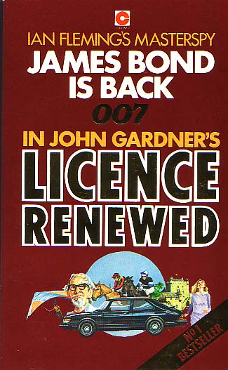
Below are three different versions of "Licence Renewed" from Coronet. All are first edition paperbacks. The difference in the two brown covers is explained here however I've never found a reason why the third blue version was printed apart from the books popularity.
 |
 |
 |
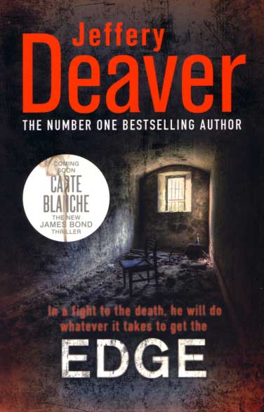
Below is the paperback version of Jeffery Deaver's "Edge" with a small circular section promoting the release of "Carte Blanche" in hardback form. The circular section is printed as part of the cover, not a removable sticker. I haven't seen this edition of "The Edge" shown on any other site, however I doubt it's that scarce. The first paperback version of "Carte Blanche" is also shown as the cover is almost identical to the hardback version section featured.
 |
 |
During the majority of the 1960s the Signet logo that appeared on the spines of Bond novels was either absent, or a black oval shape containing the word "Signet". Then in the late 1960s / early 1970s the logo changed to a circle containing the letter "S". From my experience this logo change coincided with the end of the James Bond Thriller 007 Series and the start of the Black Signet Series. At least that was what I thought until 2012 when I found this unusual copy of "Dr No". It's not a great copy at all, the yellow "Dr No" text on the spine has faded and there are creases on the cover, but it has the newer circular logo. So in a way it's a missing link between the older and newer Signet logos, perhaps indicating there could be an entire set of these books available.
 |
 |
|
 |
Below are three books with slight misprints. The first is a Pan cover for "On Her Majesty's Secret Service". I have included a copy of the normal cover on the left for a comparison. I haven't seen too many Pan covers like this so was very surprised to find this one laying face up on a shelf in a second hand book store in August 2012.
 |
 |
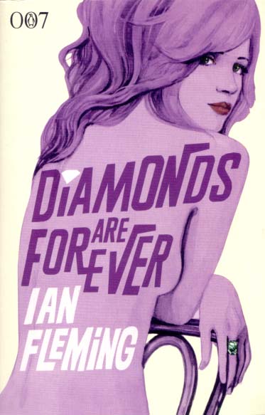
The second misprinted book is "Diamonds Are Forever" from the Michael Gillette Centenary Series by Penguin, is a printing error with one white (as normal) and the other green. The cover is actually more green than it appears here.
 |
 |
The third misprinted book is John Gardner's "For Special Services" from the Coronet-General Books MasterSpy Series printed in Canada. The standard cover is on the left while the misprinted is on the right (notice the metallic silver text looks unusual). I posted the misprinted cover image on the James Bond Collectable Books Worldwide Facebook group and received the following comments: Brian M thought it might be "caused by a fowl-up in the printing process." Ian A suggested it "looks like the gold coloured sheet didn't advance fully before stamping again. Perhaps it came to the end of the roll and wouldn't advance any further ?". While Chris H commented "One of the colour plates wasn't aligned properly. Interesting for those who like a bit of colour plate misalignment !". Personally I'm no expert on book cover printing so I was pleased to get a clearer explanation of how the issue had evolved.
 |
 |