Below are pairs of covers displaying slight variations in colour or text. There are probably heaps of examples of this in people's collections, and these were the obvious ones I found in my own:
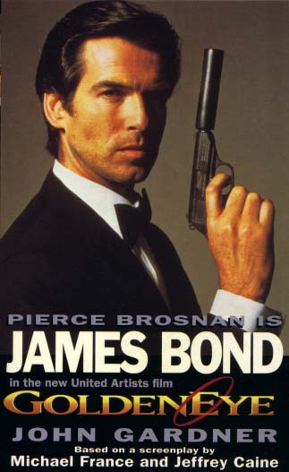
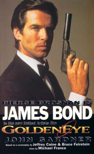
1) We start with two different versions of the "GoldenEye" movie tie-in paperback/softback written by John Gardner and published by Coronet in 1995. In this case the earlier book on the left attributes Michael France and Jeffrey Caine credit with "screenplay by". Then on the later book on the right the screenplay credit has been attributed to Jeffrey Caine and Bruce Feirstein, and Michael France's credit has changed to "story by". Also, see (13) below for another similar Coronet movie tie-in cover variation.
 |
 |
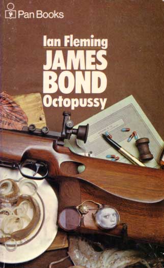
2) The Ian Fleming "Octopussy" variation from the Still Life Series by Pan is most probably a printing error with one brown and one green. The green colour on the copy on the right wraps around the entire book suggesting that the brown ink used on this 1976 edition differed from the 1973 edition on the left and over time has gradually changed colour. In this case fading caused by sunlight is unlikely as the entire cover is affected and not just the spine, however I'm now aware of some collectors having editions of this book half brown and half green so who knows !
 |
 |
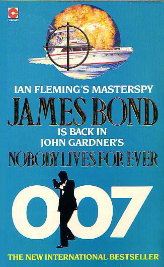
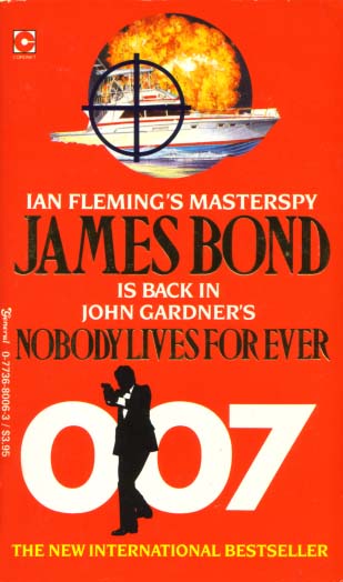
3) The John Gardner "Nobody Lives For Ever" variation from Sniper Series by Coronet is deliberate with the light blue/teal cover from the UK and the red Coronet-General cover from Canada.
 |
 |
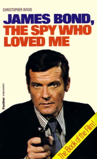
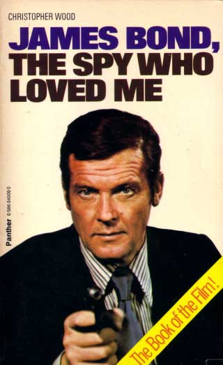
4) The Christopher Wood "James Bond, The Spy Who Loved Me" movie tie-in covers differ in the colour of "The Spy Who Loved Me" text. Both books were printed by Panther. The cover on the left with the red text is from the UK while the cover on the right with the brown text is from Canada.
 |
 |
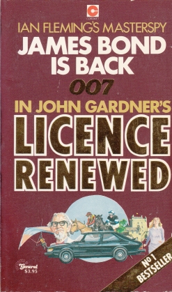
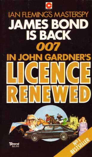
5) The John Gardner "Licence Renewed" variation from the Masterspy Series by Coronet-General Books differs in both colour (light brown and dark brown) and also the gold text on the cover on the left compared to the yellow text on the right. Both of these Coronet - General Books covers are from Canada.
 |
 |
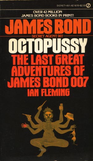
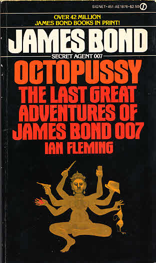
6) The Ian Fleming "Octopussy" variation from the Black Signet Series differs in the colour of much of the text on the cover. For a start the cover on the left shows the text "James Bond" in red and "Octopussy" in white. The cover on the right shows the text "James Bond" in white and "Octopussy" in orange.
 |
 |
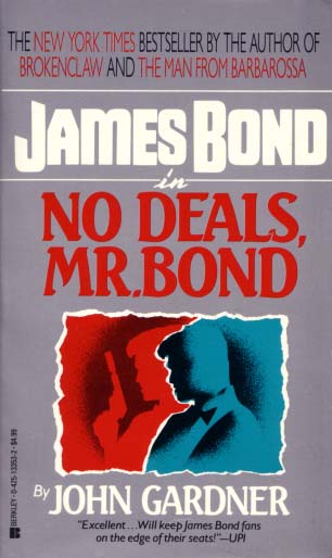
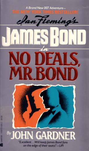
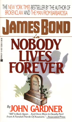
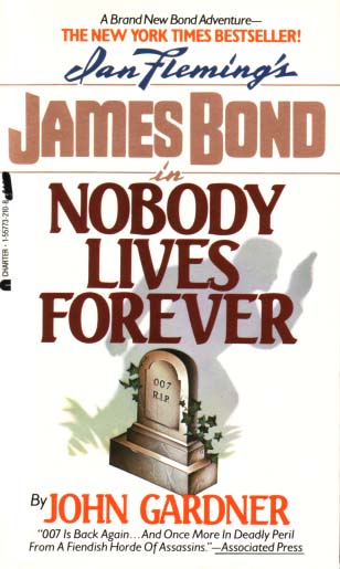
7) The John Gardner "No Deals, Mr. Bond" and "Nobody Lives Forever" variations below from the Three Images Series differ in the text at the top of the covers. Also the covers on the right, published by Charter, have a facsimile of Ian Fleming's signature which is absent from the covers on the left, published by Berkley.
 |
 |
 |
 |
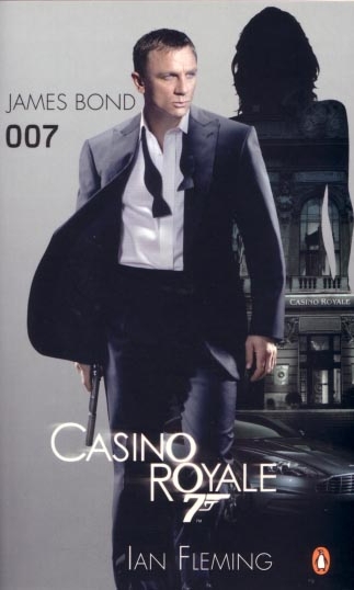
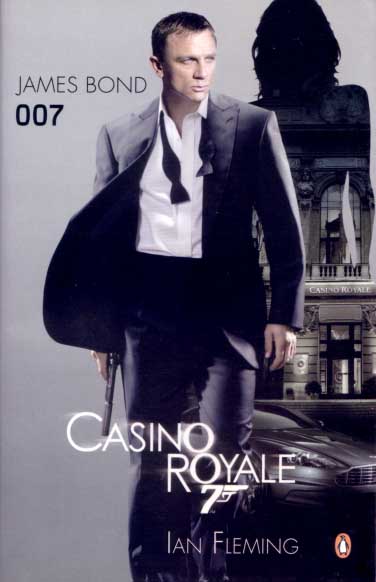
8) Below are two different versions of the "Casino Royale" movie tie-in paperback/softback from 2006 published by Penguin. John F, a regular visitor to the website, pointed it out to me in March 2013. The difference is most obvious with the head of the silhouette of the woman. As you can see on the cover on the left the head is fully shown (the Australian printing) while on the cover on the right the head is cropped (the international printing). Thanks heaps John for letting me know.
 |
 |
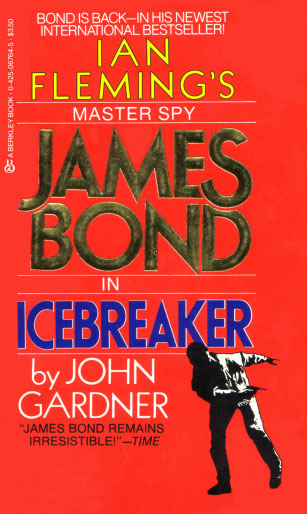
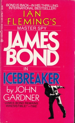
9) The John Gardner "Icebreaker" variations from the Silhouette Series published by Berkley Books differ in the colour of the text that reads "James Bond". The cover on the left with the gold text is the **th edition from 198? while the cover on the right is the 5th printing from 1986. The red colour variation between the two books is probably caused due to fading.
 |
 |
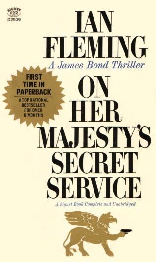
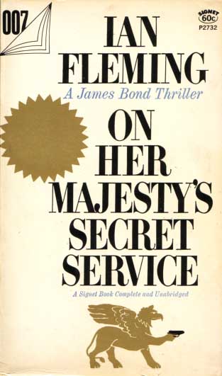
10) These two variations of Ian Fleming's "On Her Majesty's Secret Service" published by Signet in the 1960's differ in three ways. The first is in the gold stars; the cover on the left has text in its gold star while the cover on the right does not. The second is the "007" displayed in the top left hand corner of the cover on the right which is absent on the cover on the left. Finally, the Signet logo also changes position from top left to top right on the covers.
 |
 |
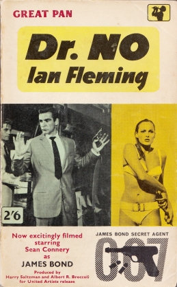
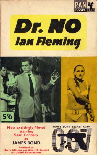
11) These two variations of Ian Fleming's UK "Dr No" movie tie-in published by Pan Books in 1962 were pointed out to me by Tim K. at Tikit and Alan T. The cover on the left was published by Great Pan with the older logo in the top right corner while the cover on the right (9th printing) was published by Pan with the newer logo. For those completists there are actually two versions of the "Dr No" Great Pan movie tie-ins with different book codes: X335 (6th printing) and G335 (7th printing). For more information have a look at the excellent Collecting Fleming website.
 |
 |
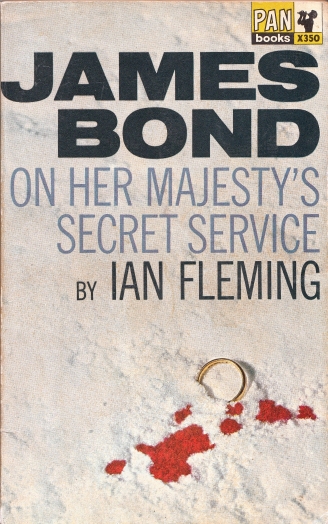
12) These two variations of Ian Fleming's "On Her Majesty's Secret Service" published by Pan Books in 1964 and 1965 respectively differ in the colour of the title text. The cover on the left was published by Pan Books with blue/purple text (3rd printing) while the cover on the right was published by Pan with light green text (5th printing). The blue/purple text apparently appeared on most 1st to 3rd printings of this cover while 4th to 6th printings have green text. And if you're fortunate enough to have a 1st printing of this paperback congratulations because it's worth much more than you'd expect. For more information about this colour variation have a look at the excellent Collecting Fleming website.
 |
 |
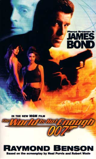
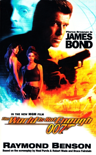
13) This variation is similar to (1) "Goldeneye" at the top of this page. "The World Is Not Enough" was written by Raymond Benson and published by Coronet in 1999. The earlier book on the left attributes Neil Purvis and Robert Wade with screenplay credit. On the later book on the right Bruce Feirstein has also been credited with screenplay credit.
 |
 |
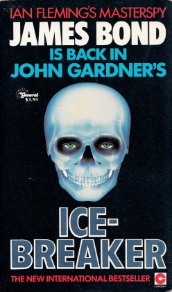
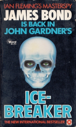
14) Both of these covers were published by Coronet - General Books in Canada in 1983. The "Icebreaker" cover on the left is almost identical to the same title published by Coronet in the UK. These covers are part of the Masterspy Series. Like the UK edition the cover on the left also features the title in a metallic silver like text. However the cover on the right has the title in light blue instead. I wasn't aware this variation existed until Ian S., a frequent visitor to this website, pointed it out to me. Thanks Ian. Further variations of this cover can also be found below on this page.
 |
 |
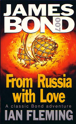
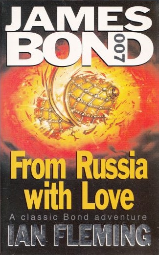
15) Here's two cover variations of Ian Fleming's "From Russia With Love" published by Coronet in 1996. Both covers were illustrated by David Scutt. Similar to The Three Faces Of Dr No the colour of the text of the author's name differs; in this case the cover on the left has embossed grey text while the cover on the right has non-embossed metallic silver like text. This is also the same on the spine (sans any embossing). These covers are part of the James Bond 007 Series. I'm yet to find other covers in this series with metallic silver like text but who knows ?! John F., a visitor to this site, pointed out these variations in an email back in 2012, and it's taken 10 years but I finally managed to find the metallic silver copy. Thanks John.
 |
 |
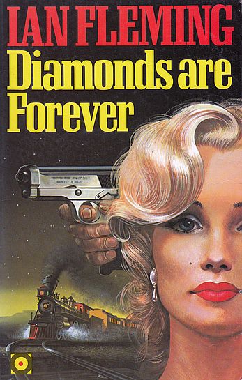
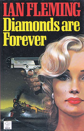
16) There are a few subtle differences between these two English second language copies of "Diamonds Are Forever". The copy on the left, printed in 1989 by Hutchinson, features a yellow, black and red Bulls-Eye logo in the bottom left corner of the cover and has the ISBN 0091299411. Meanwhile the copy on the right, printed in 1991 by Thornes, features a white and black Bulls-Eye logo and has the ISBN 0748710183. I purchased the copy on the right from John F. when he started selling his entire James Bond collection in 2023.
 |
 |
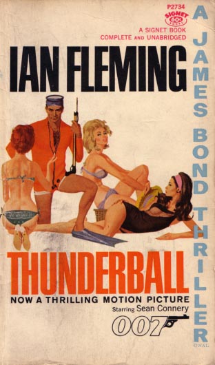
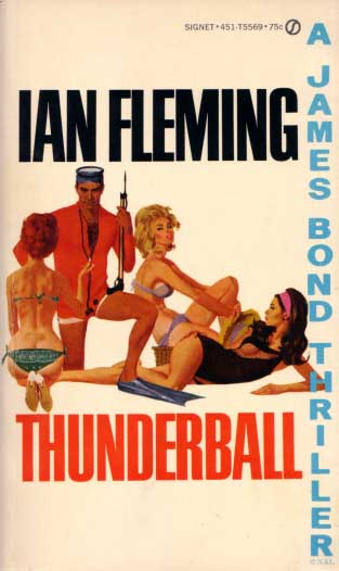
17) Here's yet another movie tie-in variation. These two copies of Ian Fleming's "Thunderball" published by Signet in the 1960's differ as the copy on the left features the text "Now a thrilling motion picture starring Sean Connery 007" while the copy on the right does not. I suspect the copy on the right was published after the film's release in the US.
 |
 |
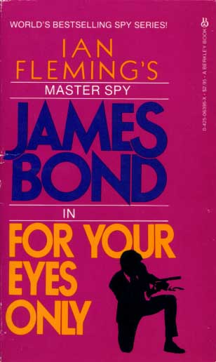
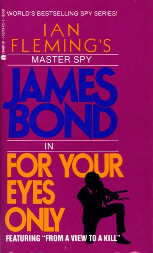
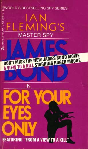
18) Here's three copies of Ian Fleming's "For Your Eyes Only" published by Berkley/Charter in the 1980's. The Berkley copy on the left was published before the Roger Moore film "A View To A Kill" was filmed. I imagine the centre copy was published by Charter when "A View To A Kill" was announced as the next James Bond film at the time. The final copy on the right was published by Berkley as a tie-in to the movie.
 |
 |
 |
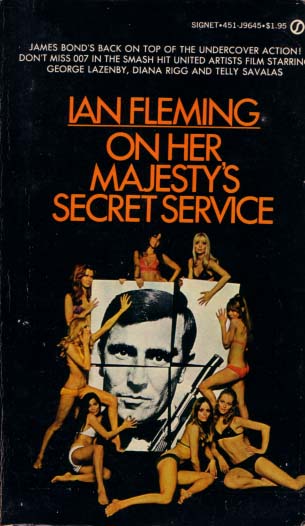
19) This page is littered with movie tie-in variations and here's another one. These two Signet publishings of Ian Fleming's "On Her Majesty's Secret Service" from 1969 differ due to the placement of the publisher's logo on the cover on the right.
 |
 |
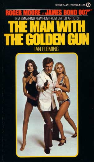
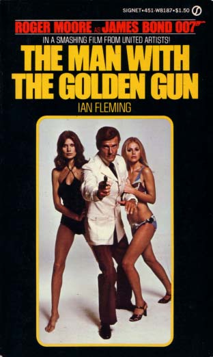
20) Another movie tie-in variation, this time for Ian Fleming's "The Man With The Golden Gun". Both copies were published by Signet in 1974. The copy on the left reads "In a smashing new film from United Artists" while the copy on the right reads "In a smashing film from United Artists".
 |
 |
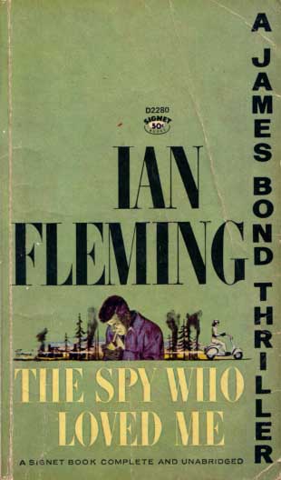
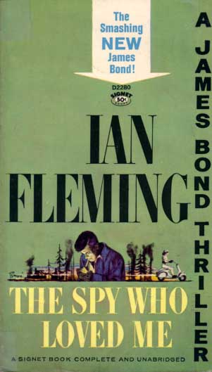
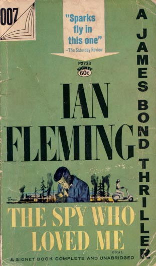
21) Three different copies of Ian Fleming's "The Spy Who Loved Me" published by Signet in the 1960's with Barye Phillips' cover art. The copy on the left is the standard copy that's part of the James Bond Thriller Series, the centre copy features a arrow with the text "The smashing new James Bond!", while the copy on the right that's part of the James Bond Thriller 007 Series features a review in the arrow with the text "Sparks fly in this one".
 |
 |
 |
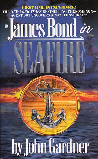
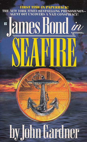
22) The John Gardner "Seafire" variations below published by Berkley Books differ in the colour of the title text. The cover on the left with the silver text is the 1st printing from 1995 while the cover on the right with the yellow text is the 3rd printing, also from the same year. I believe the 2nd printing features yellow text too but I don't have that edition.
 |
 |
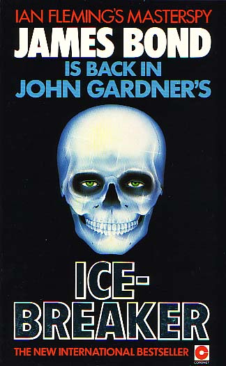
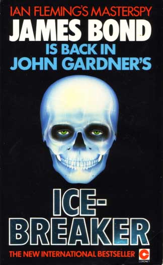
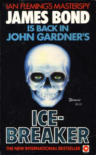
Below are four different versions of "Icebreaker" from Coronet. The first row are UK versions while the second row are Coronet-General from Canada. The story of the two UK covers belongs to John Cox and Dan Gale at The Book Bond. The mistake versions with white "fangs" (right column) are the most difficult to find.
 |
 |
 |
 |
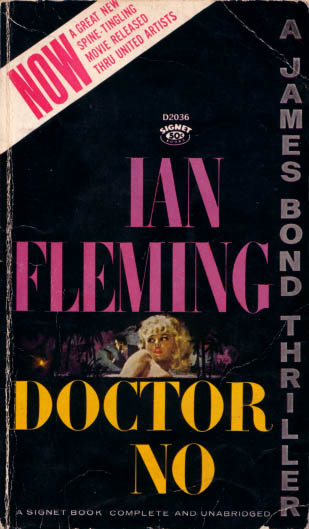
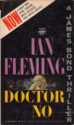
Movie tie-in variations are common on this page, probably related to the pre-release hype and then popularity of the Bond film at the time. Following are three different versions of "Doctor No" from Signet released at the time of Bond's first adventure on the big screen. The differences are related to the diagonal text in the top left corner of the cover. Two have red/pink text while the third (apart from the word "NOW") is black. Of the two with only red/pink text the word "NOW" is in a thin font on one, and a thicker font on the other. Thanks to Brad F for pointing out the existence of these variations and helping me acquire them.
 |
 |
 |
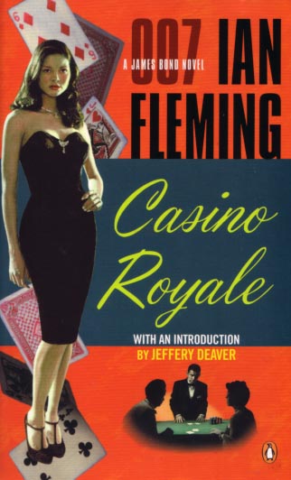
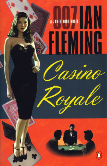
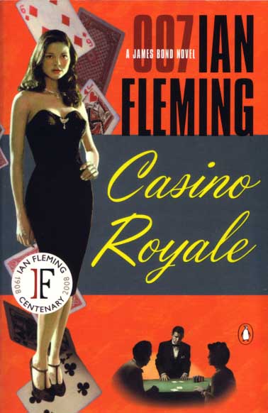
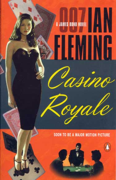
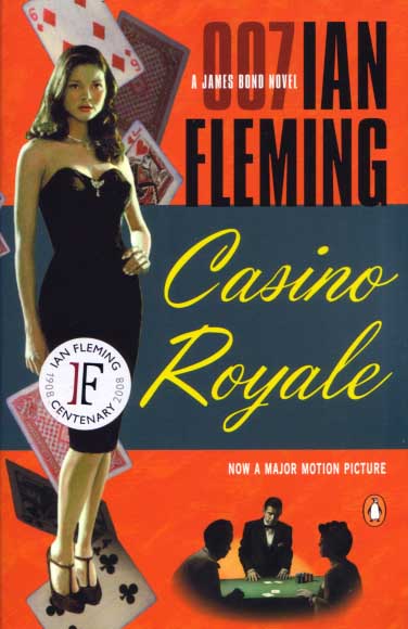
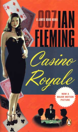
Below are six different versions of "Casino Royale" from Penguin. Top left is the UK edition, the other five are US editions. The bottom three covers are movie tie-in versions, the cover featuring text explaining "Now a major motion picture" in a circle is relatively easy to find, while the other two are very uncommon. There are also two prototype covers similar to these which you might be interested in seeing on the Prototypes page of this website. And just as a bit of trivia there is a hardback omnibus titled "The Bond Files Volume 1 - Three James Bond Novels By Ian Fleming" that features the same cover image, however as it's a hardback it's not included on this site. Penguin certainly liked this cover image !
 |
 |
 |
 |
 |
 |